In the twenty-first century, almost everyone involved in the creative field– be it fashion design, graphic design, product design, printing, and manufacturing, or even fields like event planning, or filmmaking– relies on the Pantone color palette to meet the color requirements for their products. Furthermore, in the last couple of years, it has also witnessed burgeoning popularity on the internet, with the Pantone shades becoming an integral part of popular social media aesthetics. Because of this, it has become sacrosanct, and subscribing to its aesthetic has become ubiquitous for creators across the world. But it would be surprising to know that this is not what Pantone started out as.
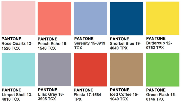
Beginning in the early 1950s in New Jersey as a commercial printing company, it took a turn when Lawrence Herbert, a chemistry graduate from Hofstra University, joined the firm and developed the Pantone Matching System (PMS), a standardized system of ten colors, in order to reduce variances in their use. These colors were presented on thin cardboard cards that came to be known as the Pantone Guides, and were organized into bundles of similar shades with varying tints. The idea behind these was to make the reproduction of colors easier by allowing the designers to “color match” specific colors. As of 2019, PMS had identified 2161 distinct shades.
In doing so, Pantone revolutionized the way color was perceived. Through standardization, Pantone created a common language through which all stakeholders– including designers, producers, clients, manufacturers, and artists– could talk about color and shades, and its subsequent expansion as a consultancy- led by color psychologists and color economists, who cater to fashion experts and interior designers, and study the impact of different colors on the human psyche- only furthered its influence as a complete lifestyle brand.
In part of establishing itself as a holistic lifestyle brand, Pantone has produced customized, trademark shades like Tiffany & Co.’s robin’s egg blue, Starbucks’ green, Coca-Cola’s and Louboutin’s red, and Hermes’ orange, all of which are now synonymous with the iconic brands they represent. All these colors are now a part of their cultural legacy.
In the year 2000, Pantone began announcing, in perhaps its most iconic move, the Color of the Year. Decided by the company after a secret meeting of representatives from various nations’ standard color groups, the Color of the Year aims to reflect the global zeitgeist and is often determined by the important events of the preceding year. Now considered to be a pop culture phenomenon, the color is widely anticipated by the global design community, for it has a direct influence on the global design trends and aesthetics for that year.
What Pantone has achieved in doing is essentially revealing the influence that color has on our everyday lives. It has made a name for itself by demonstrating its understanding of the way in which color can reveal the attitudes and emotions of people within a culture. Its influence is evident in the cultural legacy it has left behind, and the way it has reconfigured our relationship with colors.